A Comprehensive Guide to Creating Accessible and Stylish Popups
- accessibility
- alert
- animation
- aria
- best practices
- confirm
- cross-browser compatibility
- css
- css frameworks
- dialog
- event handling
- focus management
- front-end development
- html
- interaction design
- javascript
- javascript libraries
- keyboard navigation
- modal
- modal windows
- overlay
- popover
- popup
- prompt
- responsive design
- user engagement
- user interface
- ux
A Comprehensive Guide to Creating Accessible and Stylish Popups
In modern web development, popups are essential for enhancing user interface (UI) interactions, providing important information, or soliciting user input. This guide explores various techniques to create accessible, customizable, and user-friendly popups using HTML, CSS, and JavaScript. We’ll cover both built-in methods like alert, confirm, and prompt, as well as advanced solutions using the <dialog> element and the Popover API.
Table of Contents
- Introduction to Popups
- Built-In JavaScript Methods
- Custom Content and Styles
- Popovers
- Best Practices for Accessible Popups
- Conclusion
Introduction to Popups
Popups—encompassing modals, popovers, and dialogs—are interactive elements that appear over the main content to capture user attention. While they can significantly enhance user engagement and interaction design, it’s crucial to implement them thoughtfully to ensure they are accessible and responsive across all devices and browsers.
Built-In JavaScript Methods
JavaScript offers three built-in methods for creating basic popups: alert, confirm, and prompt. These methods are straightforward to use and ensure a consistent experience across different browsers and devices.
Alert
The alert method displays a simple message to the user with an OK button.
alert("An alert!");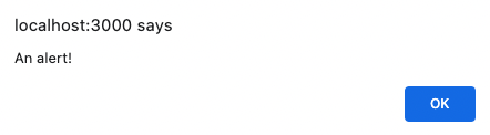
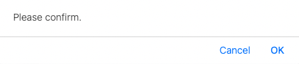
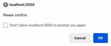
Confirm
The confirm method presents a message with OK and Cancel buttons, returning a boolean based on the user’s choice.
const confirmation = confirm("Please confirm.");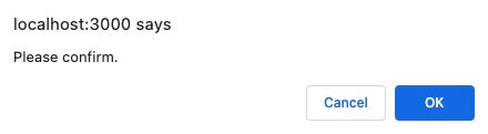
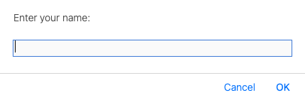
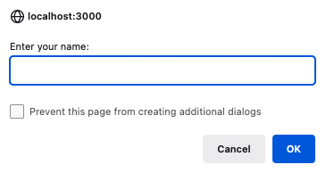
Prompt
The prompt method asks the user to input text, returning a string or null if canceled.
const name = prompt("Enter your name:");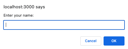
Advantages
These built-in methods offer several benefits:
- Simplicity: Requires only one line of code to implement.
- Accessibility: Automatically adapts to different devices and browsers, ensuring basic accessibility.
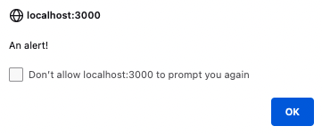
- User Control: Users can disable popups for specific websites through browser settings.
- Consistent Interface: Provides a uniform look and feel across all platforms.
Disadvantages
However, there are notable limitations:
- No Custom Styles: Limited to browser default styles, which can make your website appear less polished.
- Text-Only Content: Cannot include additional elements like images or form inputs within the popup.
- JavaScript Dependency: These popups rely entirely on JavaScript, limiting functionality in environments where JavaScript is disabled.
Custom Content and Styles
For developers seeking more control over the appearance and functionality of popups, creating custom UI components using HTML, CSS, and JavaScript is the way to go. This approach allows for greater customization, including the ability to add images, forms, and integrate with design systems.
Using the <dialog> Element
The <dialog> element is a native HTML component supported by all major browsers, providing a foundation for creating accessible and customizable popups.
Overview
The <dialog> element is best used when user action is required before proceeding, such as confirming a deletion. It comes with built-in accessibility features, reducing the amount of manual work needed to ensure compliance.
<!-- Dialog.svelte -->

<script lang="ts">
	let dialog: HTMLDialogElement;
</script>

<button onclick={() => dialog.showModal()}>Show Dialog</button>

<dialog bind:this={dialog}>
	<p>A dialog element</p>
	<div>
		<form method="dialog">
			<button>Close with method="dialog"</button>
		</form>
		<button onclick={() => dialog.close()}>Close with .close()</button>
	</div>
</dialog>
Defaults
- Top Layer: Positioned above the main content by default.
- Page Lock: Disables interaction with the rest of the page when open.
- Dismissal: Can be closed with the
ESCkey but not by clicking outside. - Backdrop: Applies a gray overlay to the background content.
Advantages
- Custom Styles: Fully customizable with CSS, allowing for seamless integration with your design system.
- Accessibility: Inherits accessibility features, such as focus trapping and ARIA roles, ensuring compliance with accessibility standards.
- Native Support: Reduces the need for additional JavaScript libraries, leveraging built-in browser capabilities.
Disadvantages
- JavaScript Required: As of June 2023, the
<dialog>element cannot be opened without JavaScript, limiting functionality in non-JavaScript environments. - Additional Code: Requires more code compared to using
alert,confirm, andprompt, especially for managing state and events. - Browser Support: While widely supported, older browsers may not fully support the
<dialog>element, necessitating polyfills or fallback solutions.
Popovers
Overview
The Popover API offers a zero-JavaScript solution for creating non-intrusive popups. Currently supported primarily in Chrome, popovers are ideal for displaying transient messages or confirmations without disrupting the user experience.
Attributes
popoverandpopovertarget: Used on separate elements to designate the popup and its trigger.popovertargetaction: Defines the action (toggle,hide,show) for the popover.
Methods
hidePopovershowPopovertogglePopover
These methods allow programmatic control over the popover’s visibility.
Code / Preview
<button popovertarget="target">Open</button>

<div popover id="target">A popover</div>
Defaults
- Top Layer: Positioned above the main content.
- Non-Modal: Does not disable interaction with the rest of the page.
- Dismissal: Can be closed by clicking outside or pressing the
ESCkey. - No Backdrop: No overlay is applied to the background content.
Advantages
- No JavaScript Required: Simplifies implementation by eliminating the need for additional scripts.
- Custom Styles: Easily styled with CSS to match your application’s design.
- Accessibility: Provides accessible defaults, reducing the effort needed to ensure compliance.
Disadvantages
- Limited Browser Support: As of June 2023, only Chrome supports the Popover API. Other browsers will render the popover as a regular element, potentially disrupting the layout.
- Fallback Necessity: Requires fallback solutions for unsupported browsers to maintain a consistent user experience.
Best Practices for Accessible Popups
Creating accessible popups is paramount to ensure that all users, including those with disabilities, can interact with your web applications effectively. Here are some best practices to follow:
ARIA Attributes
- Roles and States: Use appropriate ARIA roles (e.g.,
role="dialog") and states (aria-modal="true") to convey the purpose and state of the popup to assistive technologies. - Labels: Ensure popups have clear and descriptive labels using
aria-labelledbyoraria-label.
Focus Management
- Initial Focus: Set focus to the first interactive element within the popup when it opens.
- Focus Trap: Restrict focus within the popup while it’s open to prevent users from navigating to the background content.
- Return Focus: Return focus to the triggering element when the popup closes.
Keyboard Navigation
- Accessibility: Ensure that all interactive elements within the popup are reachable and operable via keyboard (e.g.,
Tab,Shift + Tab,Enter,Esc). - Close Mechanism: Allow users to close the popup using the
Esckey for quick dismissal.
Responsive Design
- Mobile-Friendly: Design popups to be responsive, ensuring they display correctly on various screen sizes and orientations.
- Touch Targets: Ensure that buttons and interactive elements are large enough for easy tapping on touch devices.
Animation and Transitions
- Smooth Transitions: Use CSS transitions to animate the opening and closing of popups, enhancing the user experience without causing layout shifts.
- Minimal Animation: Avoid excessive animations that can distract or disorient users, especially those with motion sensitivities.
Conclusion
Popups are a powerful tool in web development, offering various methods to enhance user interface interactions. Whether utilizing simple JavaScript methods like alert, confirm, and prompt, or implementing advanced solutions with the <dialog> element and the Popover API, it’s essential to balance functionality with accessibility, performance, and user experience.
By adhering to best practices and understanding the advantages and limitations of each approach, developers can create popups that are not only effective and stylish but also inclusive and user-friendly. Prioritizing responsive design, keyboard accessibility, and ARIA compliance ensures that popups contribute positively to the overall user engagement and interaction design of your web applications.
Key Takeaways:
- Accessibility: Always prioritize accessibility by using ARIA attributes, managing focus, and ensuring keyboard navigation.
- Performance: Choose rendering strategies that optimize web performance and minimize load times.
- Customization: Utilize custom styles and advanced elements like
<dialog>and popovers to align with your design system. - Browser Compatibility: Ensure cross-browser compatibility by implementing fallbacks for features not supported in all browsers.
- User Experience: Enhance user engagement by creating intuitive and non-intrusive popups that respect user interactions and preferences.
By strategically implementing these SEO keywords and adhering to best practices, your popups will not only enhance the functionality and aesthetics of your web applications but also improve their online visibility and user satisfaction.